How to Make YouTube Thumbnails That Get Clicks (2026 Guide)
Your thumbnail decides whether people watch your video
90% of YouTube's best-performing videos use custom thumbnails. The other 10%? They're leaving views on the table.
Here's the reality: viewers decide whether to click your video in under 2 seconds. Your thumbnail is that first impression. Get it wrong and your video dies in the algorithm. Get it right and you unlock exponential growth.
This guide covers everything you need to create thumbnails that actually get clicks.
What is a good click-through rate on YouTube?
Before optimizing your thumbnails, you need a target. Here's how CTR benchmarks break down:
- 2-4% CTR: Average. Most channels fall here.
- 5-10% CTR: Good to excellent. This is where top creators land through systematic testing.
- 10%+ CTR: Exceptional. Usually signals viral potential.
CTR varies by niche. Gaming content hits around 8.5% on average because of highly engaged communities. Educational content sits lower at 4-5% because viewers are more selective.
The takeaway: If you're below 4%, your thumbnails are holding you back. If you're above 6%, you're doing something right.
Top 5 fonts that work
- Bebas Neue: Tall, condensed, uppercase-only. The go-to for tutorials and how-to content.
- Impact: Classic bold font used by PewDiePie. Thick letterforms that stand out against any background.
- Montserrat Extra Bold: Modern and geometric. Works well for lifestyle, travel, and business content.
- Roboto Black: Google's signature font. Clean and professional for tech and educational videos.
- Anton: Bold display font perfect for gaming and entertainment thumbnails.
How to make your text pop
- Always use bold or extra-bold weights. Regular weights disappear at thumbnail size.
- Add a stroke or outline. White text with a 3-6 pixel black outline stays readable against any background.
- Stay consistent. Same font across all thumbnails builds brand recognition.
- Test at small sizes. Preview how it looks in search results before publishing.
How much text should you put on a thumbnail?
Less is more. The best thumbnails communicate their message in under 2 seconds.
The ideal text length
- 3-5 words maximum. This is the sweet spot.
- Under 12 characters performs significantly better than text-heavy designs.
- Under 20 characters is the absolute maximum.
Your thumbnail text should complement your title, not repeat it. The thumbnail hooks attention visually. The title provides context. Together they convince viewers to click.
When to skip text entirely
Some thumbnails work better without any text:
- Before-and-after transformations where the visual tells the story
- Dramatic reaction shots that create curiosity
- Channels with a minimalist aesthetic
- Content where the image speaks for itself
YouTube thumbnail colors: What actually gets clicks
Color is one of your most powerful tools. Research shows high-contrast thumbnails can improve CTR by 30% or more.
Colors that grab attention
- Yellow and orange: Convey energy and urgency. Consistently outperform muted tones.
- Red: Creates excitement and importance. Stands out against YouTube's white interface.
- Blue: Signals trust and authority. Works well for educational and business content.
- Green: Associated with growth and money. Popular in finance and self-improvement niches.
Contrast matters more than color choice
85% of viral YouTube thumbnails use at least one highly saturated color or extreme contrast element. The specific colors matter less than the contrast between them.
High-performing combinations:
- Yellow text on black backgrounds
- White text with colored outlines
- Blue and orange (complementary pair)
- Bright subject against a dark, blurred background
Should you put your face in thumbnails?
Human faces are attention magnets. Eye-tracking research shows viewers fixate on faces almost immediately. But the answer isn't always "yes."
The data on faces
- Thumbnails with expressive faces can increase CTR by 20-30%
- 72% of popular YouTube thumbnails feature human faces
- Faces help larger channels more than smaller ones (viewers recognize the creator)
A 2025 analysis of 300,000+ viral videos found nuance: for newer channels, a compelling idea or outcome may outperform a face that viewers don't recognize yet.
How to use faces effectively
- Show strong emotion. Surprise, excitement, shock, and curiosity perform far better than neutral expressions.
- Make eye contact. Looking directly at the camera creates connection.
- Position prominently. Crop tightly so the face fills a significant portion of the frame.
- Test both options. Use YouTube's Test and Compare feature to see what works for YOUR audience.
Running a faceless channel?
Focus on other attention-grabbing elements: dramatic before-and-after shots, intriguing objects, bold graphics, or text-focused designs. Many successful channels in finance, gaming highlights, and educational content thrive without ever showing a face.
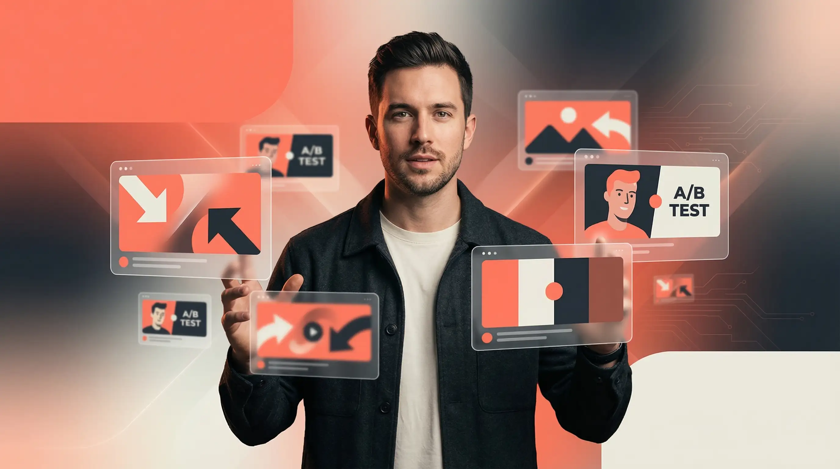
How to A/B test your thumbnails
The most successful YouTubers don't guess. They test.
Using YouTube's Test and Compare feature
YouTube's native testing tool lets you upload up to 3 thumbnail variations. The platform shows different versions to different audience segments and measures which generates the most watch time.
YouTube revealed that CTR differences of just 0.5% can be statistically significant across millions of impressions. Small improvements compound into massive traffic gains.
To access it: YouTube Studio → Select your video → Thumbnail section → Test and Compare
What to test
Change one variable at a time so you know exactly what drove the improvement:
- Face versus no face
- Different expressions (surprise vs. excitement vs. intensity)
- Text versus no text
- Color variations (bright vs. dark backgrounds)
- Different focal points
7 thumbnail mistakes killing your CTR
- Too much text. A full sentence is unreadable on mobile. Cut ruthlessly.
- Low contrast. Busy background + similar-colored text = muddy mess.
- No clear focal point. Viewers should instantly know where to look. One subject, not five.
- Misleading thumbnails. Clickbait may boost initial CTR but tanks watch time. YouTube's algorithm optimizes for watch time, not just clicks.
- Inconsistent branding. Random fonts and colors every video means viewers can't recognize your content.
- Using auto-generated thumbnails. YouTube's auto-selected frames almost never perform well.
- Ignoring mobile viewers. If it doesn't look good on a phone, you're losing 70% of your audience.
Best tools for creating YouTube thumbnails
You don't need expensive software or design skills.
- Canva: Pre-sized templates with drag-and-drop. Great for beginners.
- Adobe Express: Professional-grade editing with custom templates.
- Photoshop: Industry standard for complete control.
- Figma: Excellent for collaborative design and reusable templates.
- AI thumbnail generators: Tools like Stumbnail create professional thumbnails in seconds using AI, eliminating the design learning curve. They analyze successful thumbnails and apply proven design principles automatically.
The bottom line
Creating effective thumbnails isn't about luck or artistic talent. It's about understanding what makes people click and applying those principles systematically.
Start here:
- Use correct dimensions (1280 x 720 pixels)
- Keep text to 3-5 words maximum
- Ensure high contrast between elements
- Add emotional hooks through faces or curiosity-inducing visuals
- Test different approaches and let data guide decisions
Remember: thumbnail optimization is ongoing. The creators seeing the most growth are those who continuously test and refine based on real performance data.
Your thumbnail is your video's first impression. Make it count.
Ready to create scroll-stopping thumbnails without the design headache? Try Stumbnail for free.
Frequently asked questions
What is the best YouTube thumbnail size?
The best YouTube thumbnail size is 1280 x 720 pixels with a 16:9 aspect ratio. This ensures your thumbnail looks sharp on all devices. Keep files under 2MB and use JPG or PNG format.
What is the best font for YouTube thumbnails?
The best fonts are bold, easily readable typefaces like Bebas Neue, Impact, Montserrat Extra Bold, and Anton. Add a 3-6 pixel stroke to ensure readability against any background.
How many words should be on a YouTube thumbnail?
Keep it to 3-5 words maximum. Thumbnails with under 12 characters significantly outperform text-heavy designs.
Do YouTube thumbnails with faces get more clicks?
Usually yes. Research shows CTR increases of 20-30% when faces display strong emotions. However, newer channels may benefit more from concept-focused thumbnails since viewers don't recognize the creator yet.
What colors work best for YouTube thumbnails?
High-contrast colors work best. Yellow, orange, and red grab attention against YouTube's interface. The specific colors matter less than the contrast between elements.
What is a good CTR on YouTube?
5-10% CTR is good to excellent. Average is 2-4%. Above 10% is exceptional. CTR varies by niche, with gaming around 8.5% and educational content around 4-5%.
Can I change my YouTube thumbnail after publishing?
Yes. Go to YouTube Studio → Content → Select video → Upload new thumbnail. Changes take effect immediately without affecting your URL, views, or comments.
Ready to Create Better Thumbnails?
Start using AI to generate click-worthy thumbnails in seconds.
Try Stumbnail